Glenn

July 23, 2016

https://i0.wp.com/bloximages.chicago2.vip.townnews.com/ithaca.com/content/tncms/assets/v3/editorial/0/97/097f0d3a-4eb3-11e6-afd5-775ba276fddf/578fd695598a6.image.jpg

Laura Glenn, Whale Ride, mixed media on paper


Also in this week’s Ithaca Times:


“Personal Abstractions”—the title of local poet-painter Laura Glenn’s current solo

show—embodies a seeming contradiction. Generally, “abstraction” refers to

precisely what is most impersonal. In visual art, the meaning is different but the

suggestion remains of a style reduced to the basics, shorn of anything

idiosyncratic or unnecessary. And while there’s a lot to be said for the reductive

approach, it is largely out of keeping with the local artistic temperament. (As I’ve

said before, what happens on-campus is rather different, unsurprisingly leaning

towards more intellectual—or, too often, faux-intellectual—approaches.) From

questionable café art to more professional work: the tendency is for the “colorful,”

the eclectic, the playful, and the mythopoetic. For better and for worse, this is us.


Up this month (through June 30) at the Community Arts Partnership’s ArtSpace

gallery, “Personal Abstractions: Paintings and Collages” consists of a generous

selection of Glenn’s signature mixed-media works on paper, framed behind glass

and given an irregular hanging that enhances engagement rather than detracting

from it. I’ve never seen so much of her art in one place and my estimation of it

has improved considerably as a result.


Glenn’s painting-drawings combine such materials as ink, watercolor, and pastel

with the frequent collaging of tiny scraps of paper. These are sometimes thin and

wrinkled and often dyed, drawn or painted-over, or feature hard-to- decipher

reproduced patterns or images. Her backgrounds, softly inflected with a single

color or a patchwork of colors, suggest underwater environs. (Enclosed in their

black frames, I think of aquariums.) Black ink scribbles mimic Chinese

calligraphy—perhaps reflecting a longing for a culture in which art and poetry are

not separate endeavors. The effect is self-consciously lyrical, with all the

promises and risks that that implies.


About a third of these pieces are excellent. But honesty compels me to say what

I think is wrong with most of the work here. (And this relates to work of hers that

I’ve seen in the past.) There are too many pieces, which—if I may stretch my

aquatic analogy—appear washed out, tepid in their overall tonality. More

attention holding, if cloyingly so, Ziggurat employs a melted rainbow of

background colors just barely saved from incoherence by fields and bridges of

black ink scratchings.


Glenn fares much better when she deals in stronger colors and stronger

contrasts. I love pieces like Arrangement —with its painterly collage of thin,

textured papers—as well as the would-be- Chinese Afterthought and the

endearingly gritty Taking Off and In the Café.


Whale Ride is particularly musical in its interplay of colors and textures. It also

benefits tremendously from its presentation. Unlike her other pictures here, she‘s

chosen to “float” it on the white matboard, emphasizing the rough edges and

irregular boundaries of the papers—particularly a mountainous scrap of bright

ochre that juts out from the top edge of the central square. Glenn plays saturated

colors off of thinner ones and offsets the ochre and a central area of thin, foggy

brown with enframing black shadow and patches of cool colors.


There’s something very Ithacan about this sort of abstraction: tinged with fantasy

and surrealism; eclectic and impure; seemingly unconcerned with appearing

“advanced.”


That Glenn, as far as I know, always works on paper is also indicative.

Abstraction on paper is almost a genre of its own in local art. In this regard, the

artist has marked affinities with the likes of Scout Dunbar (now of Brooklyn),

Peter Fortunato (also a poet-painter), Syau-Cheng Lai (a pianist and polymath),

and Melissa Zarem—all artists who use the support exclusively or nearly so.

Paper is a lovely material to work on and it facilitates the combination of drawing

and painting techniques, as well as the use of collage. But it also implies

casualness in a broader artistic culture where working on a more durable support

remains the norm. Echoing the purposeful informality of indie rock, the

suggestion—and often the reality—is of artists without dedicated studios, of work

done on kitchen tables in one’s spare time.


Well-known local abstractionist Barbara Mink usually paints on canvas but she’s

currently showing works on paper at Decorum Too in the DeWitt Mall, also

through the end of the month. The two exhibits are well worth comparing.

Two cultures redux

July 15, 2016

Franklin Einspruch at Artblog.net on art,sports, and academic culture:

Rather, what we need is a massive shakeup of the professional system, and in that I include the universities, about which its denizens can protest all they want but there’s no such thing as academic radicalism. We also ought to recognize that the critical community is largely stuck in conversation with itself. This conversation is often only tangentially about art and thoroughly divorced from non-expert aesthetic experience, even among newspaper and magazine critics who ought to know better. We should open it.

Chris Harrington in the Times: “The cool thing about art is that it has the unwavering endurance to challenge your mode of thinking, however rigid it may be. It reorganizes your mind, twisting things like assumed absolutes and the wobbling condition of your fluxing ego.”

Taft/Onodera

July 13, 2016

https://i0.wp.com/www.cornersgallery.com/wp-content/uploads/2016/06/Traversing_lores.jpg

Suzanne Onodera, Traversing the Steep Ravine, 50″ x 76,” oil on canvas (2 panels), 2016,


Two-person exhibits in Ithaca are often ad hoc pairings. As such, it’s always encouraging to see two artists, strong in their own right, whose works elucidate each other’s through meaningful similarities and differences. Such is the case with the current “Summer Show” at Corners Galley in Cayuga Heights (it’s up through the end of August). Curated by gallery owner Ariel Bullion Ecklund, it features oil landscapes by local painters Suzanne Onodera and Stan Taft.

Onodera is a well-established artist, with gallery representation in California, Arizona, and Vermont as well as with Corners. “The Wild and the Deep,” her 2014 solo show at Corners, was a tour de force. 

Her canvas and panel oils, often large, are abstracted landscapes: contemporary versions of the Romantics’ sublime vistas. While the classical European landscape offers the viewer places to stand, Onodera’s imaginary scenes transmute solid masses into ghostly liquescence. Her use of amorphous fogs and glazes, subtly accented with more visible brushwork, has been characteristic. 

Onodera’s work here though has evolved, with her brushstrokes becoming thicker and heavier, with emphatically expressionist blocks of color standing out more against the thinly painted backgrounds. 

A diptych on two upright canvases, Traversing the Steep Ravine is the largest piece here and the most overtly ambitious. Patches of acidic green—accented in bright yellow-orange and shadowed in black—help make it legible as a “landscape” but any sense of here-and-there is necessarily slippery. As in other pieces of hers here, a mountain seems to rise in the distance. Both the sky above and the river that winds its way down to our feet are in pale, softly brushed colors. 

And Other Observations, a smaller near-square piece on panel, is just as compelling. The brushwork is brusque and broken while the palette combines the ethereal and the earthy. 

Stan Taft, a longtime professor of art at Cornell, has had two previous solo shows at Corners. His exhibit last year, “Tree + Landscape,” showed off something of his eclectic range as a painter. The “tree” series featured black silhouettes against fields of flatly painted, often lurid color. Subtler—and easier to digest—were his landscapes, regional scenes of nature and countryside carefully observed and transcribed with both precision and verve.

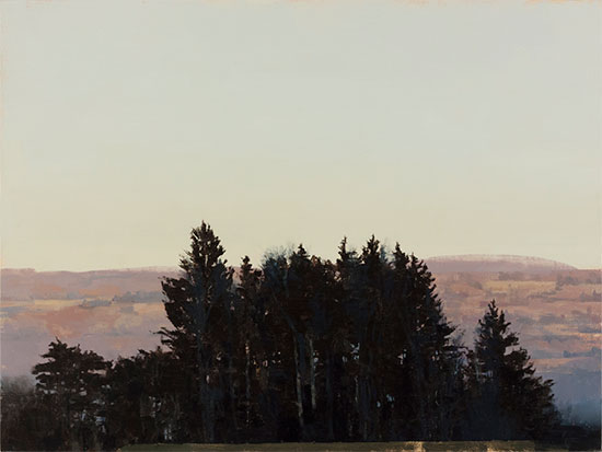
For the current exhibit, Taft has continued in the latter mode. His panel paintings here have a remarkable sense of clarity and luminosity with a subtle painterliness inflecting a typically crisp delineation of receding areas of land and water. Skies are often smooth and their light infuses the whole scene. Cayuga Lake is often visible in the distance. An orange underlayer often peeks through the paint application. 

Lansingville Road, a larger panel piece, is particularly striking. A smoothly painted pale blue sky—tinged with yellow—spills down more than half way while a distant hillside in impressionistic pale purples stretches down nearly to the bottom edge. The foreground is defined by a copse of trees, silhouetted in black and rising to touch the sky near the center. These have been accented in a faint blue, suggesting not so much highlighting as haunting. Taft likes to play with the idea of a foreground plane—here as elsewhere, the bottom edge sports a flat band, which on closer inspection, turns out to be a roof.

White Barn is a jaunty winter scene on small panel, memorable for the crisply defined miniature building that anchors its lower right corner.

Although not evident from the focused selection here, Taft’s wide-ranging body of work is interesting as a bridge between modernism and postmodernism: two cultural world-views apparently no longer on speaking terms. His most basic stylistic approach is in the tradition of a sort of modernist realism—in addition to the great French Post-Impressionist Paul Cézanne, it recalls the careful, rigorously empirical work of the 20th century British painter William Coldstream and his followers. But there’s also another side to his work: an idiosyncratic eclecticism of style and subject matter as well as an—often literally—oblique approach to narrative. 

That I tend to be skeptical of such approaches is well known—still, it might be interesting to see some of this more “difficult” work outside the campus setting. 

This Friday, July 15 from 5 to 7 p.m., Corners Gallery will be holding a reception for both artists.

Arts and crafts

July 12, 2016

There’s an interesting (and characteristically thoughtful and
well-written) article by Amber Donofrio in last week’s Ithaca Times.
The subject is “Fifteen: Celebrating 15 Years of the Quilt Divas,” a
fascinating and often superb exhibit up at the Community School of
Music and Arts through June and July. (Go see it if you haven’t.) And
I sympathize with her desire to question the distinction between art
and craft, with all its gender-laden baggage.

But I’ve found—and it seems that she has found—that the
distinction doesn’t go away just because you want it to. That is, the
terms that she uses to praise the work in the show are precisely those
that have traditionally been used to separate art from craft: i.e.
individualism, innovation, and an independent (but informed)
relationship to tradition and convention. It’s not that there’s any
reason to believe these things have ever been wholly absent in
so-called craft. But the emphasis on these things here—and the
presentation of these works in a gallery space—marks these things as
“art”. (Also, as usual at the CSMA, there’s a preponderance of
wall-mounted work.) How does one escape this?

Now, I don’t believe that it’s desirable or even coherent to draw a
rigid distinction between the two. And the notion of banning work from
the realm of art based on material or technique or “functional” status
is a non-starter. But if you’re going to use the notion of “art”—and I
think it remains a compelling one—then the distance from “merely”
decorative or functional work comes along for free. These are thing we
have to work with.

Personally, I’m interested in writing about pictorial art (and to a
lesser extent, sculpture, which I think does something related.) And
yes, I believe that this is “a thing”: roughly an arrangement of marks
on a flat surface that creates an illusion of virtual,
three-dimensional space. (The British philosopher of art Paul Crowther
discusses this brilliantly, in this book and elsewhere.) I think
pictures—and particularly the sorts of pictures we designate as
art—are powerful things. They engage the human mind in ways that
bedspreads and wallpaper typically do not. (Although this clearly has
a lot to do with presentation.) And so I think that any critique
of traditional notions of art that doesn’t acknowledge this power is
likely to fall flat.

I also like abstract art, which I think of as a species of
picture-making. The making of geometric patterning—whether conceived
of as art or not—is an ancient human activity. And there’s no reason
to see modern abstract art as something entirely separate from such
traditions. The human mind (also a thing) makes associations based on
common experience. The artistic use of lines and shapes and colors
necessarily draws off of this. (See this book for a defense of such
ideas.) But the twentieth-century abstract tradition uses this common
stock in a new way. It allows geometry to be pictorial—and
expressive—in a newly robust sort of way. (I’m thinking about this in
relation to this show, which I am writing about.)

Much of the work in “Fifteen” is intelligible as abstract art and I
believe Donofrio is correct to approach it in this way. And the
tendency, it seems, is to arrive at abstraction by means of
traditional quilting motifs and/or techniques. Which is all well and
good—indeed, a source of strength. But the sense of distance doesn’t
go away, or at least not for me it doesn’t.

Anyway, the best way to work all of this out (to the extent that
that’s possible) is not by pontificating so much as by making things
and looking and the things that other people have made.

Seeing memorials

March 18, 2016


13-130597 Hirosh Cenot view R adj

A shorter version of this was published in this week’s Ithaca Times

There is a strange kinship between photography and the structures people build to commemorate historical tragedy. Photos have the ability to pull from the past—a particular moment and point-of-view, a unique appearance. They give a semblance of immortality to the evanescent. Memorials, of course, have a physical presence that photographs lack. Often they take on an abstract form, easily legible, meant to dignify loss but at the risk of distracting or distorting. But the two modes complement each other—think of how iconic facades lend themselves to postcards. Both make public what might otherwise be private.

The intersection of these two forms of remembrance is a major concern for Ben Altman, an Ithaca-area photographer who also works in sculpture, installation, and performance. A British native, Altman has been a full-time artist in the area for about a decade. Before that, he lived for twenty-five years in Chicago, where he did commercial photography—learning techniques he now uses to different ends.

Since 2013, Altman has made several trips, traveling around Europe, the United States, and Japan, seeking out memorial sites and markers. The Holocaust has been a recurrent theme but Altman’s investigation is more general. How do people give physical form to traumatic memory?

Nearly fifty, mostly recent, images from Altman’s ongoing “Seeing Memorials” series compose an exhibit of the same name, currently on display at the Community School of Music and Arts. The show, which concludes this month, was put together by Altman with help from CSMA director Robin Tropper-Herbel. The presentation is generously large, filling the school’s basement gallery as well as the lobby. (A selection from the same series, mostly different, was shown early last year at Corners Gallery in Cayuga Heights alongside work by Laurie Snyder, another local photographer.)

Altman will also be exhibiting his related “Site/Sight” series this spring at Light Work, a photography center in Syracuse. Shot in parallel to “Memorials,” these center, not on the sites themselves, but on fellow visitors caught in the act of picturing them. (This self-reflexive questioning of the medium is characteristic of Altman’s approach).

A series of four Charred Remains prints from a decade ago serves as a kind of prelude. Shot in Idaho in the aftermath of a fire, these black-and-white close-ups of fallen trees revel in crisp details, rich textures, and abstract but familiar forms. As with Edward Weston’s (1886-1958) famous shots of green peppers, an analogy to the human form is inescapable. In the context of “Memorials,” these reclining, contorted torsos become sinister.

Most of the work here was shot using a Holga, a cheap “toy” camera made lacking standard controls and made entirely out of plastic—including the lens. Manufactured in Hong Kong since 1981 and recently discontinued, the device has developed a cult following that has built an aesthetic around its technical limitations. Altman’s Holga images display a characteristic loss of peripheral focus and vignetting—a quite noticeable shadowing around the corners.

According to the artist, this is meant to be akin to human vision, which also loses color and focus outside its center. More broadly, it serves as a metaphor for the limitations of human understanding, memory, and empathy.

The bulk of “Seeing Memorials” is made up of 12” x 12” Holga images with the larger prints shot using a 4×5 (film) view camera. The pictures have been arranged in rows and (in the case of the former) stacked grids, meant to emphasize formal and thematic connections. The overall presentation has a neat symmetry and a deliberate quality that is rare in exhibitions of local art.

Most of the pieces have been printed in black-and-white, with strategically placed color images adding to the varied cohesion of the overall collection.

A row of three large (20” x 26”) monochromes hung on the gallery’s central back wall forms a centerpiece. In placing them together, Altman has used similarities of form and composition to draw analogies between the three disparate sites.

On the left is Cenotaph for the Victims of the Atomic Bomb, Hiroshima, Japan, unusual here for its symmetrical composition and straight-ahead perspective. (It’s also his only image from his Japanese trip.) The view centers on the saddle shaped concrete arch, which shelters a symbolic grave stone. Through it—in a carefully calibrated view—we see the famous Genbaku Dōmu (Atomic Bomb Dome), the ruins of the pre-war Hiroshima Prefectural Industrial Promotion Hall. A flower-filled planter out in front and the lush spring foliage that enfolds the scene at middle distance offset the severity of the arch and the surrounding plaza.

Like the larger Hiroshima Peace Memorial Park of which it is a key part, the cenotaph was designed, in the early fifties, by the celebrated Japanese modernist architect Kenzō Tange (1913-2005).

Occupying the center of the CSMA lobby’s back wall, WWII Memorial Outside Saint Paul’s Cathedral, London shares the neat left/right symmetry of Cenotaph—this time, our view is aimed downwards, a mild disorientation. The structure commemorates Londoners killed in the war. Its design is modest but elegant: a flattened cylinder of dark stone with indented, serif-capped letters. We can read: “1939-1945 REMEMBER.” The structure is encircled by a drain and a decorative border of paving stones. A stone plaza, slick with rain, fills the rest of our view.

On the right is Cemetery Entrance Gate, Wounded Knee, South Dakota, USA. The picture has its own dignity yet does not attempt to conceal the awkwardness of the site. The viewer is placed at an oblique angle to the gate, which consists of a narrow bridge of scaffolding—surmounted by a cross—held up by two thick pillars of brick and whitewashed blocks. Mismatched fences surround it. In the foreground there is an entrance ramp and a patch of mostly shadowed dirt. Above, the sky is an impassive even tone. We can see little of the actual graveyard—mostly a cluster of stones underneath a silhouetted tree in the center.

The cemetery commemorates the 1890 Wounded Knee Massacre, in which over 200 Lakota Indians—men, women, and children—were killed by the U.S. 7th Cavalry Regiment, under the direction of Colonel James W. Forsyth.

Hung separately, A Native American History of the United States (I abbreviate some of these titles), shows us the backside of one of the pillars. The tall image neatly frames the central column with an indistinct view of the rural landscape in the distance. The white painted surface has been covered with marker writing. But this is no ordinary graffiti—rather we are presented with a timeline of violence and other indignities perpetrated by the US government against the native population. A blunt injunction at the top tells us to “F— Historical Trama” [sic]; at the bottom,, we are reminded that “The Meek will own the Earth.”

A grid of 12” x 12” Holga images focuses on found text, found at a variety of memorial sites and encompassing several languages. These are in muted color or black-and-white. They are characterized by their oblique viewpoints and their cropping and blurring. All of these qualities serve to make much of the writing difficult or impossible to read. Locations and events memorialized range from Columbine and Wounded Knee to Dresden and several European World War I sites. The writing ranges from poignant or descriptive history to warnings and regulations.


22-150611H-9 Amiens Cath

Memorial Plaque, Amiens Cathedral, Somme, France is the most aesthetically striking of these. Improbably enough, the French and English plaque—hung above us to the right—commemorates a division of soldiers from New Zealand who died in the Battle of the Somme. (The sign, though emphasized in the shot, must be an inconspicuous presence within the grand Gothic interior.) Here we see the skinny bundled columns, archways and tall windows through a dream-like atmosphere of shadow and blur.

Hung near the staircase leading to the CSMA’s basement gallery, another sub-series recalls the work of Aaron Siskind (1903-1991), whose photographs of textured surfaces are frequently compared to Abstract Expressionist painting. Shot at the Nazi camps of Breendonk, Mauthausen, and Ravensbrück (in Belgium, Austria, and Germany, respectively), these larger digital color images have a beguiling beauty that is difficult to reconcile with the unspeakable acts we are meant to associate them with.

27_DSF3484 Breendonk #1

Breendonk, located outside of Antwerp, was constructed as a fortress in 1906. Obsolete for that purpose, the Germans in the occupied country turned it into a prison camp in 1940. In Breendonk Fortress Camp #1 and #2, Altman has captured one of its stranger details: windows painted blue, presumably to block the light or view for the inmates. The effect in both images is like stained glass, creating an incongruously sacral effect.

Altman has reserved the basement for Holocaust-related pictures, mostly square Holga shots with one grid of them in color.

Echoing the hanging upstairs, a row of three 20″ x 26″ black-and-white prints lines the back wall. Punishment Block, Ravensbrück Camp for Women echoes the formal symmetry of Cenotaph. So too does Symbolic Rail Tracks, Treblinka II, Poland, which portrays a procession of concrete “tracks” built during the Soviet era to commemorate the death camp. Symbolic Recreation of “The Tube,” Museum Memorial Site at Bełżec Camp, Poland displays an uncanny affinity to The More that Is Taken Away, a performance piece, for which Altman literally dug an earthwork cum grave in the backyard of his rural property.

33-150705-8 Ravensbrück Concentration Camp, Germany

The human body and its absence forms a subtext for Bathtubs, Ravensbrück Camp for Women, a poignant and eerie still-life. The black-and-white Holga picture shows six abandoned tubs, seen obliquely in a diagonal procession that stretches from background to fore. Two are ajar relative to the others, setting up a strange visual rhythm overlain with a waffle-like grid of lights coming in from the upper-left corner. As in a Cubist painting, the space—and our relationship with it—is unclear.

It isn’t easy to address an act of historical mass killing effectively in a work of visual art, particularly through a series made long after the fact. The art that comprises “Seeing Memorials” combines a palpable material lushness with a literary approach to metaphor and meaning that avoids the trap of easy answers at the possible expense of moral irrelevance. The project is fun, if harrowing, to write about—filled with visual analogies and inviting far-ranging historical reading. Whether it goes beyond this is an open question.

“Seeing Memorials” is on display at the Community School of Music and Arts from February 5 through March 25. “Site/Sight” can be seen at Light Work in Syracuse from March 21 through July 22.


Kahn

May 15, 2015

csma-ink-shop

H. Peter Kahn, Field, 1965, color woodcut

(The following article also appears on the Ithaca Times website.)

It’s not rare to find an exhibit at the Ink Shop that impresses with its display of professionalism, ambition, talent, and unpredictability. (I’ve written about countless such shows over the years.) But it is unusual for the print shop and gallery to put together work of museum-level historical importance. Such is the case with their May-only show, which features paintings and works on paper by the late Hans Peter Kahn.

Kahn (1921-1997) is a legendary figure in the local art community. Born in Leipzig Germany, he came to this country in 1937, his family fleeing the Nazis. He lived in New York City and studied with the Abstract Expressionist painter Hans Hofmann—like himself a German émigré and a prodigious teacher. He took a position at Cornell in 1957 and taught there beyond his retirement in 1984. For many years, he took students in his storied barn studio in Trumansburg. His younger brother is the famed landscape painter Wolf Kahn and his wife Ruth Kahn is the author of the classic children’s book My Father’s Dragon. (Both are alive and Ruth, in her 90s, attended the crowded opening).

Every year, the Ink Shop awards a Kahn Family Fellowship in his honor. The program is available to artists with a background in printmaking and awards a stipend as well as full membership in the cooperative.

Curated by the Ink Shop’s Christa Wolf, “H. Peter Kahn Retrospective” fills the lobby and back hallway of the Community School of Music and Arts. Most of the work is landscape, interpreted with a striking degree of freedom.

Two tall oil-on-canvas paintings dominate the back wall of the lobby gallery. Fall Creek recalls the Post-Impressionists with its facets of electric color. A brilliant blue river zigzags vertically through a thick patchwork of twilit autumnal tones. Green Landscape recalls Hoffman with its more agitated paint handling and unpredictable use of color.

Other paintings, most of them smaller, anchor the lobby gallery. Ghost Ranch is particularly striking with its dry muted colors and phantom-like pentimenti.  Hanging over the staircase, by the CSMA’s front windows, Samos Valley portrays a panoramic, Mediterranean-looking landscape in two conjoined wood panels. (The other paintings are all on canvas.)

Peter-Kahn_Proof-Orchard-535

H. Peter Kahn, Orchard, undated, color woodcut

Woodcuts and other works on paper occupy the lobby as well. Wolf (whom I briefly assisted in arranging the show) deprecates slightly the more “old fashioned” prints here, which date from the ‘40s and ‘50s and emphasize urban subjects. An untitled black-and-white print is the best of these, showing two anonymous figures seated on an arcing row of park benches. The stark simplicity and tilted-up perspective recall Japanese prints.

A worn-out wooden desk covered in a Plexiglas vitrine houses a carefully arranged still life of the artist’s sketchbooks. We see glimpses of work in pastel, watercolor, and ink—as well as Kahn’s working notations.

Hung in the back hallway, an untitled drawing in soft charcoal shows a levitating panorama from somewhere far above Cayuga’s waters. Cornell’s historic Foundry building and what appears to be the Johnson Museum are visible to the left.

Woodcuts make up the bulk of the exhibit, particularly in the hallway. On the evidence here, they are some of Kahn’s best work. Done in black ink with or without one or more additional colors, they engage in exploratory registration, resulting in work of compelling abstraction. These “late” prints span the sixties through the artist’s final decade.

They’re most memorable when they have a cleanness and clarity to them. Orchard places black ink “drawing” against a smooth gradient of dusky blue intermingled with olive drab. Delicate specks of unprinted paper give the scene the feeling of lace. A similar airiness characterizes many other prints. Field is both dense and yet somehow insubstantial. A horizontal band of Indian yellow courses through the dark cyan meshwork of Lakeside.

“Retrospective,” as rich as is, only hints at the full significance of Kahn’s work.  An intellectual as well as an accomplished craftsman, his interests spanned art history, artists’ materials, and graphic art. A book with images of his calligraphy (available for purchase) demonstrates another passion.

An auspicious pairing: the Ink Shop is also showing, in their second floor space upstairs, the work of local photo-artist Laurie Snyder, a student and friend of Kahn’s.

May 14, 2015

When I read newspaper art criticism, I am usually on the lookout for openly offered opinions. I want to know what the critic thinks — and enjoy sensing the irritation or passion behind what is said — and I like to get a sense of what the critic might argue about larger historical movements such as cubism, surrealism, modernism, and post-modernism. I get annoyed if I think the critic is using the pluralism of the contemporary art scene as a license not to think about larger issues, or if I suspect the critic is hiding a lack of reflection behind a facade of brilliant writing. 

— James Elkins, from What Happened to  Art Criticism?

Snyder Duets

May 13, 2015

8704b39b36e5867f-W3withstonesJ28_8361

Laurie Snyder, Weavings with Stones, 2015, Digital print from collage with lake stones

I am back in the Ithaca Times!:

A tension between imagery and physical process animates the recent work of photographer and mixed-media artist Laurie Snyder. Photos are manipulated, cut-up, layered with mark-making or objects—and often re-photographed in a playful process more akin to collage than to the cold objective eye traditionally associated with the art of the lens.

Snyder, a long-time Ithacan, earned a BFA from Cornell in 1982 and a MFA from Syracuse University in 1987. She taught at Ithaca College in the ‘80s. During that decade, she also wrote art reviews for the Ithaca Journal. Although a professor at the Maryland Institute College of Art in Baltimore from 1993 until retiring last year, she has spent her summers in town, where she returned with her late husband, the pioneering photo-artist John Wood.

Wood passed away in 2012. “Duets: Reveling in Remembering,” her current show at the Ink Shop Printmaking Center, features posthumous “collaborations”: new pieces made from and in response to his old work.

This is Snyder’s third exhibit since returning full-time to Ithaca. Earlier this year, she showed botanical cyanotypes at the Nevin Center at Cornell Plantations and gelatin silver (black-and-white) prints at Corners—the latter in a memorable two-person show with kindred local photographer Ben Altman.

Her best work in this more eclectic presentation is also her most directly physical: beautiful handmade books and intricately textured paper weavings. Both take her husband’s art as their raw material.

Numerous smaller books line a long shelf. Laid out on a table below are three larger pieces that invite delicate perusal. Fold Cut Bind 1 and 2 juxtapose monochrome photograms (a camera-less light printing technique) into cryptic abstract dramas.

Compiled from Wood’s ink drawings, Arcs is even more striking. His curves seem to move and develop as if animated—at first they are mostly black-and-white and dull purplish but they soon grow colors: softly sherbety or sharply acidic, sometimes iridescent. They recall the abstract watercolors of modern composer John Cage.

Made from nearly-discarded photograms, Weavings 12, and 3 manage a density of dots and lines, in black-and-white with hints of color. In Weavings with Lake Stones, Snyder has placed small stones over a weaving and re-photographed the whole ensemble. Like several other pieces here highlighting the artist’s collection of “lucky stones,” the piece has the complexity of an elaborate private ritual.

Snyder’s work indicates a fascination with “process” characteristic of a strand in the post-‘60s avant-garde. Partisans of this tendency could give a more sympathetic account then I can of some of this show’s slighter efforts.

A digital triptych, Schoodic Point Arcadia, Maine recalls the experimentalism of Earth Art—popularized by a 1969 exhibit of that name at Cornell. A sequence of near-identical views shows a stony beach onto which Snyder has placed a black-and-white photo, taken by her husband at the same place twenty years prior. Moving from left to right, the sheet becomes progressively covered in the rocks.

Like many of the photographs in “Duets”, her digital color stands for the present, his film-based black-and-white the past—here being buried. As with most of the works in the show, it’s easy enough to unearth the metaphorical resonances. But these metaphors could be more richly embodied: the composition is uncompelling enough without being repeated and the characteristically muted color seems indifferent.

To a greater or lesser extent, a similar thinness of realization characterizes several other pieces. John’s Thumb 1986, Laurie’s Thumb 2014, for example, which juxtaposes hers in color with his gigantic in black-and-white (measurement, proportion).

In the best photos here, Snyder’s play of image and material feels more organic. John’s Sycamore Bark 1987 and Laurie’s Bark 2014 is exemplary: the original a close-up of a tilted branch with torn flesh, the latter an irregular hole-covered scrap from the same tree.

Two portray “whirligigs,” spinning contraptions sculpted by Wood. In the color digital John’s Whirligigs at Sunset,these wooden birds crowd a snowy field. In the gelatin silver Whirligigs at Assateague Island they perch upon a beach—the counter-clockwise tilt of the camera-angle echoing their own whirling blur.

Photography, at least in its pre-digital incarnations, is a form of printmaking. The Ink Shop deserves credit for putting up Snyder’s ambitious photos and photo-based works.

Little bits and pieces

March 17, 2015

I am a very poor blogger and lazy writer, apologies.

 “Seeking Mr. Aalto’s timeless modernism , Mr. Phifer has been exploring the horizons of glass throughout his 18-year-old practice, exploiting its transparency, reflectivity and indeed the glow” — Alexandra Lange on the new wing at the Corning Museum of Art

 “I am reminded of a famous drawing by the Zen monk Sengai Gibon (1750-1837) that represents the universe as a chain of three overlapping shapes: a square, a triangle, and a circle. In Guston’s images these shapes masquerade as pines, hedges, topiary trees, hooded heads, bare bald heads, boulders, hewn stones, tablets, clocks, wheels, and so on in a ceaseless metamorphic series emanating from each of these primary iconographic emblems.” — Robert Storr on Philip Guston 

 “With pen, ink, and watercolor, the Boston-based artist creates maps of imaginary places that tap into the essence of urban form.” — Laura Bliss on Emily Garfield

 More reading material.

 New work and a redesigned website by Ithaca/Brooklyn artist Scout Dunbar. Hopefully we’ll be seeing more of her work around here. (Incidentally, her mother is local stained glass artist Linna Dolph. I wrote about their wonderful two-person show at CAP last year.)

— New show of paintings by Stan Taft: “Tree + Landscape” at Corners Gallery.

 And another Laurie Snyder show: “Reveling in Remembering” (that’s enough  alliteration) at the Ink Shop in April.

 Looking forward, with some reservations, to “Locally Sourced” this summer at the Johnson.